EQRS Case Study
EQRS: Enhancing Quality of Care through Streamlined Data Management
Opportunity: To create a web portal for dialysis facilities nationwide to submit facility, patient, and clinical data. The portal allows the government to measure and ensure the quality of care delivered to patients.
Vision and Goals
– Design a role and access management system for hundreds of thousands of users (government, dialysis facilities, and networks).
– Understand role types and scopes within EQRS.
– Analyze authentication and role management tools.
– Identify access protocols and swift revocation methods.
– Understand and streamline role request approval processes.
EQRS Project UX Activities
- Research
- Definition
- Ideation
- Prototype
- Implementation
– Conducted in-depth research on the legacy system and compared it with the proposed solution.
– Explored the capabilities of Okta and Saviynt APIs to design role request flows.
– Analyzed current and future role scenarios through collaboration with internal and external SMEs.
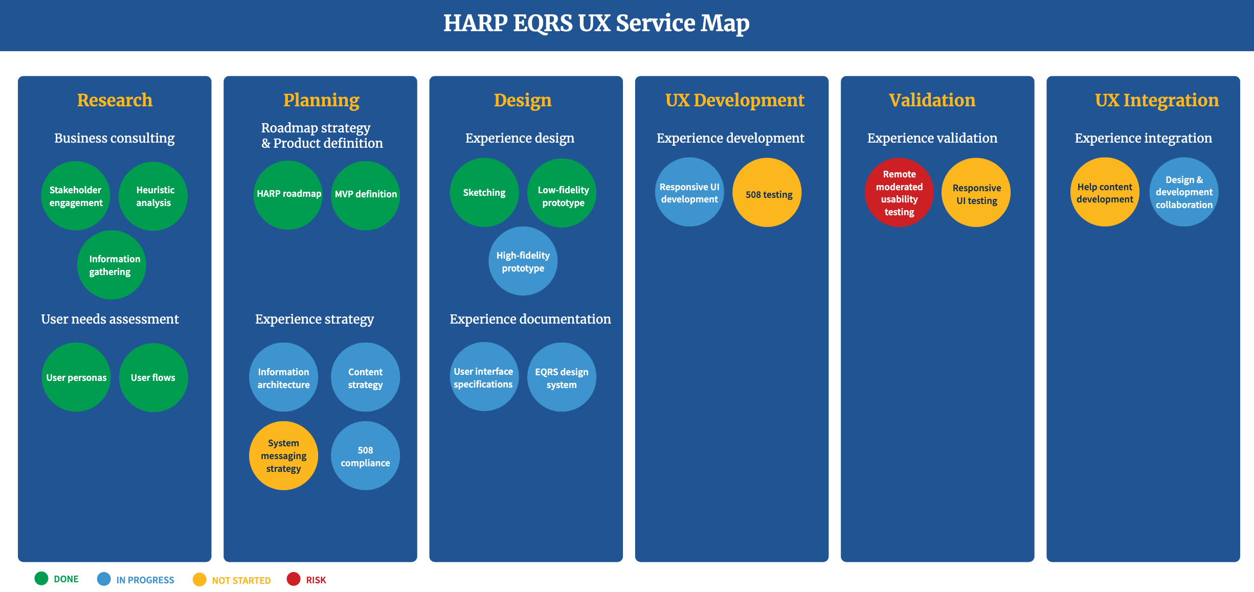
UX Service Map
Developed a UX Service Map to visualize all UX activities required for the role and access management feature, serving as a roadmap for developers, testers, and other teams.
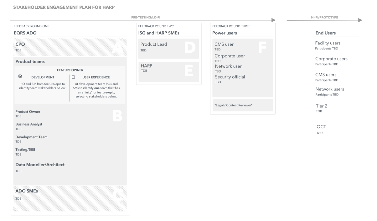
Stakeholder Engagement Plan
Created a detailed stakeholder engagement plan to ensure the right people were involved at the right time, promoting transparency and alignment across internal and external teams.
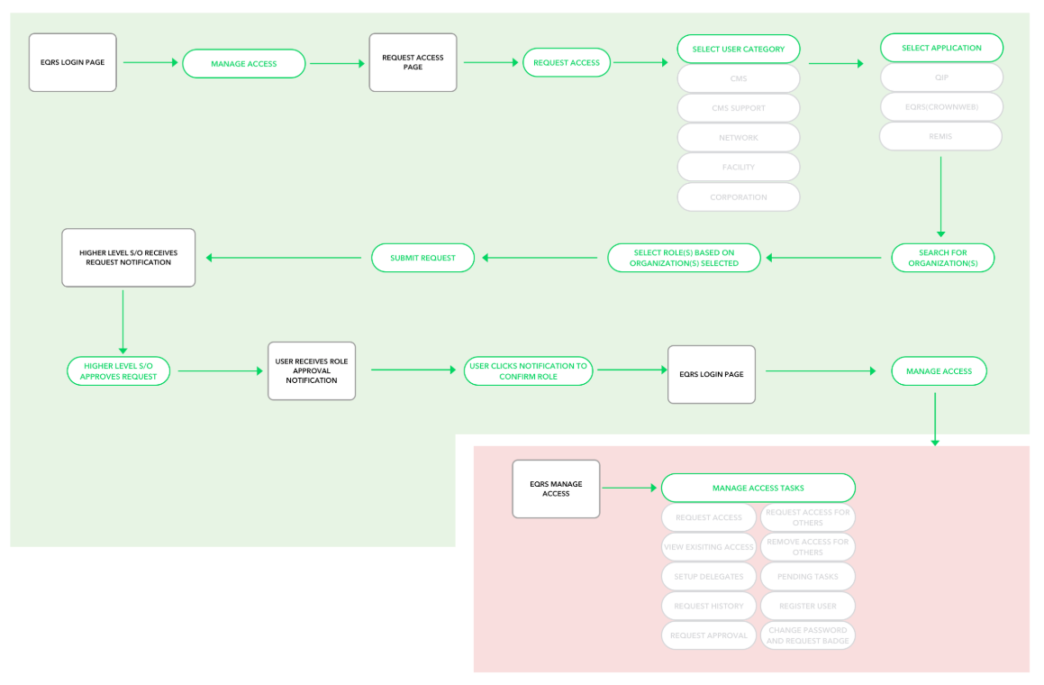
Role Request User Flows
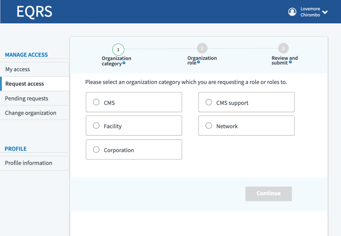
Crafted user flows to guide the role request processes, which were then translated into sketches and wireframes, setting the stage for usability testing.
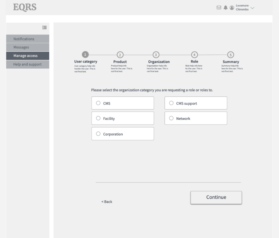
Sketches and Wireframes
Initial paper sketches evolved into wireframes, which were tested to validate design concepts and improve upon the legacy system.
User Testing
Conducted comprehensive user testing, including test plan creation, user interviews, baseline testing of the legacy system, and testing new designs. Feedback was crucial in refining the user flows and interface.
Interface design
Delivered high-fidelity prototypes with detailed UI specifications for developers and testers. Interactive prototypes were created in InVision, and the front-end was coded in Angular 7 based on these prototypes.
Design System
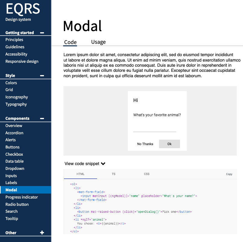
Established a design system as a centralized source of truth for developers, testers, and designers. This system was based on the CMS Design System (design.cms.gov) and the United States Web Design Standards (USWDS), facilitating faster and more accurate implementation.
Front-End UI Development
Acted as a liaison between the UX and development teams to ensure the successful implementation of the front-end UI for the Angular application focused on role and access management. I also contributed to HTML/CSS development as needed, ensuring the responsive design adhered to all design standards.
UI Specifications
Provided comprehensive UI specifications to developers and testers, streamlining their work and ensuring adherence to the design system.
Responsive Design Strategy
Developed a responsive design strategy tailored to diverse devices, browsers, and audiences. Educated internal teams on the importance of responsive and adaptive design, ensuring a seamless user experience across platforms.
My Proud Moments

MySSA – Simplifying Social Security
Redesigning the way Americans interact with Social Security—because getting what you need shouldn’t be a headache!
